Two topics that are right up my alley: international conflict and data visualization. Put the two together, and you have a truly thought provoking piece of work.
David McCandless is a “visual journalist” who specializes in visualizing data across numerous subjects. In his latest work for The Guardian’s Data Blog, David visualize a ton of data regarding troop deaths and injuries, size of forces by country, as well as the civilian toll in Afghanistan.
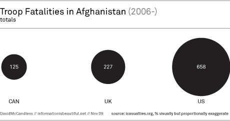
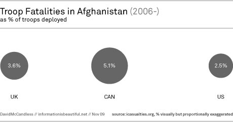
Like all good visualizers, David tells a story with his infographics, putting many issues in perspective (likely creating some “oh, I didn’t realize” moments for readers) through the use of relational data. For example, David compares absolute measures of troop fatalities by country to fatalities as a percentage of total troops deployed. What one sees is that while the US has lost the most troops by far, the Canadians have lost the most troops as a percentage of those they have deployed:
The piece is chock full of infographics like this. One issue I have with David’s analysis comes less from the data (and it’s visualization), and more with his commentary. One infographic depicts the number of troops in Afghanistan by country or organization (e.g. NATO, etc). David includes a bubble for private security contractors (PSC), which I think is great as it is a key statistic that we should be taking into account. However, while his own data shows that only 3,000 of these contractors are armed he makes the comment that “that’s a huge amount of hired guns”. Now David may just be using the common phrase of ‘hired gun’ to refer to all PSCs, but when talking about PSCs such a phrase implies something very specific (i.e. contractors that carry and use weapons in theater–not just logistical support, etc). If he isn’t just using the phrase in the generic sense then the claim is overblown. By his own numbers, armed PSCs only make up a little over 1% of the entire fighting force in Afghanistan (3,000 out of 292,486). I am not sure 1% constitutes a lot of hired guns.
The best part about how David operates is that he provides links to all his data (including what was used for this article) via Google Docs. This is a great practice, one that encourages readers to check his work, look for additional patterns in the data, and ensures that any errors in presentation or interpretation can be brought to light and discussed. (David has altered other infographics based on reader feedback.) I wish more people would adopt the practice.
In any event, be sure to check out David’s blog and other work.
[Cross-posted at bill | petti]

Petti is Associate Director of Insights and Analytics at Alexion . Previously, he served as Lead Data Scientist in the Decision Sciences group at Maritz Motivation and a Global Data Strategist and Subject Matter Expert for Gallup.

0 Comments