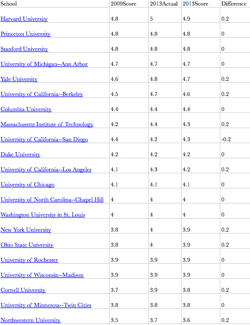
I performed a similar operation to Scatterplot, e.g., estimated the results of the current poll by assuming equal weighting for both the 2013 and 2009 poll results (explanation). For the Departments that moved from ranked to unranked in the 2013 rankings I assumed a 1.9–as it looks like 2.0 might be the cutoff for ranking schools.
I forgot to include the actual rankings, though, so my spreadsheet (direct download) only includes scores. If someone wants to do a better job, feel free to start with the spreadsheet I created. Or just make your own.
I haven’t checked my work, but it looks like the largest changes in raw score were +/- .4. GWU was among the biggest gainers, the New School among the biggest losers.
Below the fold is a screen capture of some of the top scorers sorted by estimated 2013-only results. Remember that these are simply reputation-based rankings.
Daniel H. Nexon is a Professor at Georgetown University, with a joint appointment in the Department of Government and the School of Foreign Service. His academic work focuses on international-relations theory, power politics, empires and hegemony, and international order. He has also written on the relationship between popular culture and world politics.
He has held fellowships at Stanford University's Center for International Security and Cooperation and at the Ohio State University's Mershon Center for International Studies. During 2009-2010 he worked in the U.S. Department of Defense as a Council on Foreign Relations International Affairs Fellow. He was the lead editor of International Studies Quarterly from 2014-2018.
He is the author of The Struggle for Power in Early Modern Europe: Religious Conflict, Dynastic Empires, and International Change (Princeton University Press, 2009), which won the International Security Studies Section (ISSS) Best Book Award for 2010, and co-author of Exit from Hegemony: The Unraveling of the American Global Order (Oxford University Press, 2020). His articles have appeared in a lot of places. He is the founder of the The Duck of Minerva, and also blogs at Lawyers, Guns and Money.


0 Comments